Navigation bars and different types of menus in web design are vital for website users to move between pages, and for effective internal linking and structure. But you don’t need to opt only for a static menu, or a hamburger menu. Instead you could consider a slide out menu. But what is this? And what are the different options for designing effective slide out menus? Well, here at Pumpkin Web Design Manchester, we are Manchester’s leading web design experts. We provide, high quality, effective, web design solutions for local companies and businesses across Manchester, and the surrounding area, including Wigan and Southport. As a result, we have produced this guide to everything you should know about using slide out menus in web design.
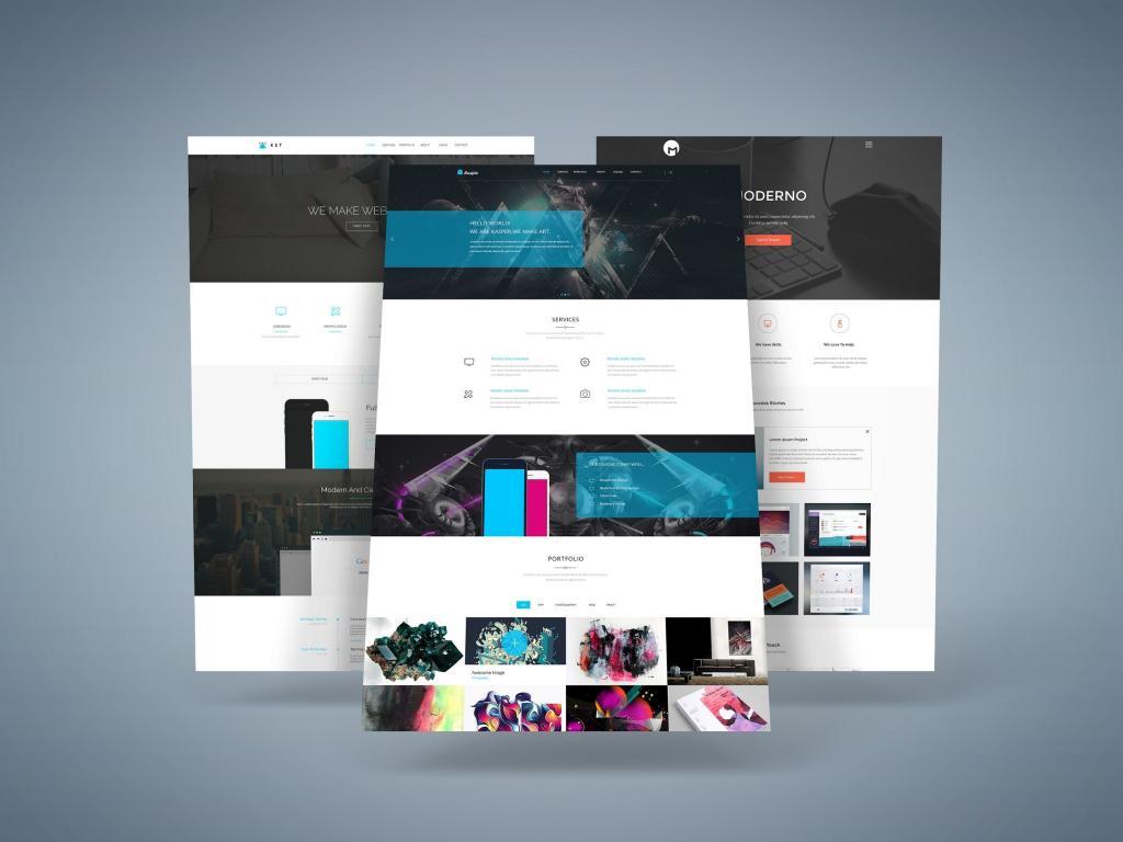
What are slide out menus in web design?
Slide out menus are a fairly popular way to display your navigation menu. Especially on a mobile device where the screen size is rarely optimal. With a slide out menu, the navigation menu simply slides out, either at the touch of a button (desktop) or the swipe of a thumb (mobile). This is an interactive feature that can actually be quite pleasing.
However, using a slide out menu does mean that a user, or a potential customer, in a hurry, might not be able to find the information or page they need instantly. Which could lead to more people leaving your website. And missed opportunities for sales. In a lot of cases though, this is unlikely. The slide out menu has been around for a number of years, and a lot of your users will be used to the format.
What are the important considerations when using slide out menus in web design?
So when it comes to using slide out menus in web design, there are a number of tips and considerations that could help you get the most out of your design. These include:
- Using the whole space available- Instead of just settling for a list of pages, why not make better use of the space? A slide out menu essentially provides a whole other screen for you to use. So why not use a call to action button on this screen? After all, it’s the first thing that users will open after your website has loaded.
- Design to fit with your style- So the slide out menu might provide a whole new screen, but that doesn’t mean you need a whole new design. Make sure you stick to the web design and branding you have already been using. This includes the colour scheme, typography and style of the images used.
- Make it visual- While you will need some text labels to identify the pages, your slide out menu can also be visually effective. Go for illustrations or images that sum up the content of that page, or even just some really good pictures of your product. Just make sure they fit with the rest of your web design, across the rest of the website.
For more information, or for professional web design solutions that really get results, get in touch with Pumpkin Web Design Manchester today.