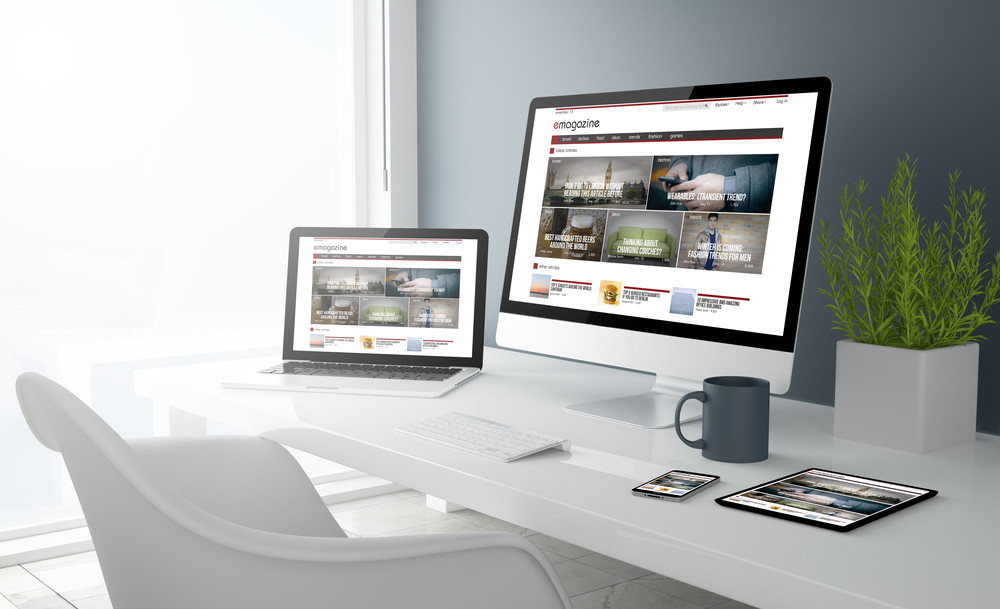
The layout of your website can have a big impact on the overall visual effect, and the user experience as well. But what should you avoid when creating your website layout? And why is this important? Well, here at Pumpkin Web Design Manchester, we are Manchester’s leading web design experts. We work with companies in a range of sectors across the North West, including those in Blackburn and Chorley, to provide top quality, effective web design solutions. As a result, we have produced this guide to everything you should know about the common layout mistakes in web design.
What are the biggest layout mistakes in web design?
So, what are the web design layout mistakes that are frequently seen? Well, there are several, including:
- Using the wrong type of navigation bar or menu
- Not planning the above the fold content
- Not using enough negative space
Using the wrong type of navigation bar or menu
Deciding on a navigation bar or menu that fits with the design scheme and the layout is important. Using a large, static, horizontal navigation bar for example, on a website using a minimalist web design layout, can be the wrong choice. This would detract attention away from your visuals and imagery, and would not fit with the rest of your layout. Instead, you should consider hiding the navigation bar behind a slide out option or a hamburger menu, to make sure that your layout makes sense.
Neglecting the above the fold content
An essential part of designing your website layout should involve determining the content, and the structure, of the area above the fold. This is what will load first when users land on your website, and it should be designed to grab attention and interest. Large visuals, large typography, and an effective call to action button should all be positioned in this area for your layout, and your website to be effective. Using hierarchical content structure can also be beneficial.
Not using enough negative space
Negative space in web design is the space between each element. This is space that is used solely for positioning and structuring your layout. But too often in web design not enough negative space is used, to create adequate distance between elements. And this can lead to a website that feels visually overwhelming for users, as well as distracting. Increasing the negative space can help elements within your layout attract attention, and stand apart from the rest. This is important for any website layout, from a modular grid, to a split screen or minimalist website.
For more information or professional web design support, get in touch with the team here at Pumpkin Web Design Manchester today.

