Here at Pumpkin Web Design Manchester, we are Manchester’s leading web design professionals. And we work with companies and clients around Manchester, and the surrounding region, including Wigan and Southport, to provide stunning and effective web design solutions. As a result, we have produced this guide to everything you should know about the most frequent design mistakes for “about us” pages.
What are the most common web design mistakes for “about us” pages?
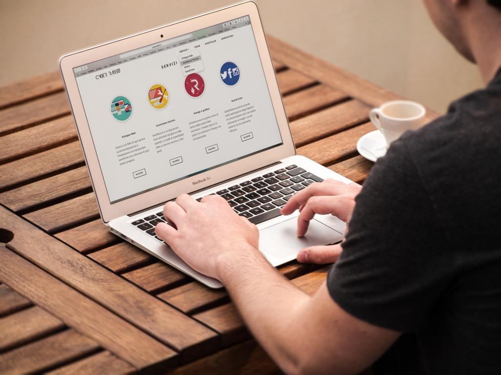
The “about us” page should be the hub of information regarding your company and staff. This should give your potential customers or clients key information about why they should choose your business, while also helping to build trust. Unfortunately, too many local businesses, and small businesses, overlook the design of this page, instead focusing attention on the landing page and product or services page. And this leads to a range of web design mistakes. So what are the web design mistakes for “about us” pages? And how can your company avoid these? Well, there are several mistakes to avoid, including:
- Not using imagery
- Using block text
- Choosing a poor layout
Not using imagery on “about us” pages
Failing to use imagery on your “about us” page can be a big design mistake. Imagery is an essential component for every single page on your website, including the “about us” page. Using professional imagery here can help show off your staff and team, so that potential customers and clients can put a face to a name, and build trust with your company. As a result, you should also avoid stock imagery on this page too, to maximize the potential for consumer connection.
Using block text on “about us” pages
If a website user, or potential customer or client loads your about us page to find nothing but a wall of text, they will quickly leave again. The information and content on your “about us” page may be important, but this needs to be positioned and used in a way that makes it easy to skim and scan, so that your potential customers or clients can find what they want, quickly and easily. Using sub headings and typography can be a good way to divide the text based content and balance out the visual design to make your “about us” page more visually interesting and appealing.
Choosing a poor layout for “about us” pages
Ignoring the layout of your “about us” page can be detrimental to the impact this can have. Too many “about us” pages use a layout that is difficult to navigate, or simply uninteresting. Instead, the layout of your “about us” page should make website users want to scroll through the content to find out more. For your mobile design, you will need to ensure that you use a responsive layout to give mobile users the best possible experience when browsing your website.
For more information or professional web design support, get in touch with the team today, here at Pumpkin Web Design Manchester.