Unique typography, eye-catching headings, and stylish, brand associated lettering make up a small, but important portion of your web design. Typography and font design can be a great tool for adding visual interest and focal areas to your website. But these need to be in balance with other design tools, and used sparingly to get the best results. Here at Pumpkin Web Design Manchester, we are Manchester’s leading web design experts. We work with companies in a range of sectors across the North West, including those in Blackburn and Chorley, to provide top quality, effective web design solutions. As a result, we have produced this guide to using calligraphy fonts for your website.
Using calligraphy fonts for your website
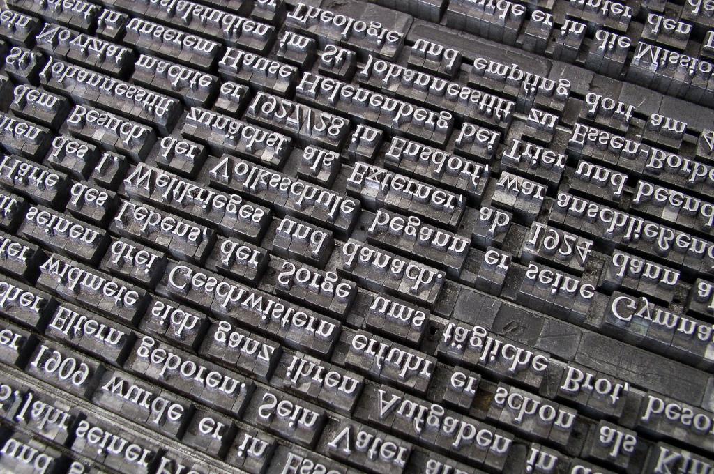
Calligraphy fonts are fonts that are designed to look like handwriting. But if you’ve ever tried to read a doctor’s notes, you’ll know that handwriting isn’t always that easy to decipher. So why would you use this on your website? Well, not all handwriting is a puzzle. And if you can read your chosen font at different sizes, then using this calligraphy font could really help to set your website apart. However, there are also some considerations for you to bear in mind.
Considerations for calligraphy fonts in web design
So, what should you consider before choosing, and using a calligraphy font? Well, there are several things, including:
- Responsive design- For your website to work well, attract users and get results, you’ll need a website that responds to changes in the screen size and resolution. This is known as responsive web design. And it means that your website is still accessible, and visually appealing, on all screens, no matter the size. For mobile devices especially, this is very effective. But in terms of calligraphy fonts, it means that these fonts will need to be readable on a range of screen sizes. So make sure you experiment with different fonts, on different devices, before settling for a calligraphy font.
- White-space- Calligraphy fonts tend to be fonts that embellish the natural form of the letters, twirling loops and adding flourishes to the words. This makes them very visually attractive. But it also means they can be difficult to read, especially on small screen sizes. Increasing the white-space around the words and letters is a good way to make sure they stand out, and can be easier to read.
- Less is more- for any website, calligraphy fonts can be a great addition. But less is always more. This means that you should only choose one calligraphy font to use per website. This font should be used for eye-catching pieces of content, above the fold, or for headings. And all other text should use a complimentary font type that is much more plain and easy to read. This will create a contrast between the forms of writing, which again will add visual interest to your website. But it will also ensure that most of the text is easy to read.
For more information or advice, get in touch with the experts today, here at Pumpkin Web Design Manchester.